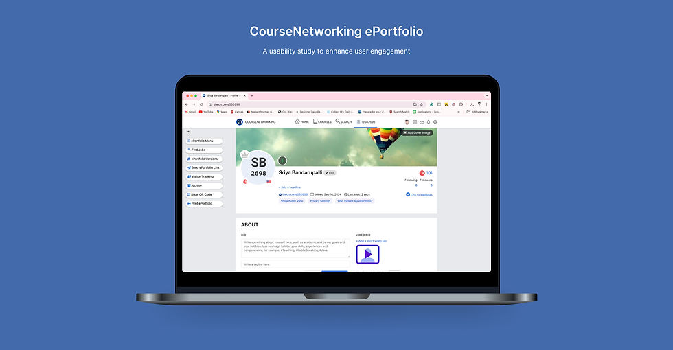
OVERVIEW
In this project, we focused on improving the usability of the CNe Portfolio website. Through user research and testing, we identified key issues in navigation, design consistency, and performance. Based on these insights, we made design recommendations.
My role
UX Researcher
Duration
8 weeks
Team
5 members
Tools
Miro, Google forms, Excel
Client
CourseNetworking ePortfolio
About
CourseNetworking (CNe) is an academic social networking platform designed to help students and educators connect, collaborate, and build lifelong ePortfolios. Unlike LinkedIn, CNe focuses specifically on academic milestones, allowing users to document their academic journey, track progress, and engage in educational communities.
THE CHALLENGE
During our initial evaluation of the CNe ePortfolio section, we noticed several usability challenges affecting the overall user experience.
Complex Navigation
Users struggled to locate key features like creating portfolios or joining communities.
Resume upload confusion
Users were unsure whether their resumes were successfully uploaded and expected the system to autofill their profiles.
Community engagement
Users had trouble understanding the purpose of communities and how to join them.
FORMING RESEARCH QUESTIONS
To address the identified usability challenges, we developed research questions focused on uncovering the root causes of user difficulties and guiding our investigation
How intuitive is the platform’s navigation?
Can users easily find essential features like portfolio creation and community engagement tools without confusion?
Do novice users require additional support?
Can new users complete basic tasks such as signing up and uploading resumes without assistance, or do they encounter obstacles?
How can community engagement be improved?
What changes can be made to foster better user participation in communities and enhance overall interaction?
METHODOLOGY
Transforming research questions into actionable insights
Usability Testing
SUS Surveys
Data analysis
Recommendations
USABILITY TESTING
Think aloud Usability Testing
3 tasks
We asked the participants to perform 3 tasks from the website followed by questions and discussions.
10 participants
Conducted think-aloud sessions with students representing high school, undergraduate, and graduate school.
Why Think-aloud?
Think-aloud testing helps identify pain points by making visible the internal thought process of users. By recording the time on tasks, we could quantify how efficiently users performed and identify areas of confusion or frustration.
Benchmark
We set the benchmark by deciding what the ideal outcome for each task should be based on user expectations and common actions.
Levels of Success method
We classified the success of each task into four categories
Success
Success with Minor Issues
Success with Major Issues
Failure
Evaluating Key User Interactions with the Platform
1
Uploading a Resume
-
Lack of feedback after uploading.
-
Users were unsure if the upload was successful.
-
Success Rate: 70% of participants successfully completed this task without any issues, while 30% faced minor problems like confusion over whether their resume was uploaded.

No success message after upload
2
Joining a Community
-
Difficulty locating the “Join a Community” feature.
-
Confusion about what a community is and how to find it.
-
Success Rate: 80% of participants faced major issues completing this task, with only 20% failing to join a community entirely.

Button does not stand out
No clear indication of CTA button
3
Posting a Poll
-
Participants didn’t realize they needed to join a community first before posting.
-
Confusion over poll visibility options.
-
Success Rate: 70% of participants completed the task with major issues, while 30% failed.

COMMON USABILITY PATTERNS
60% of users were uncertain about the success of resume uploads.
100% of users struggled with understanding how to navigate to the community feature.
70% of users clicked on the poll button before joining a community, leading to confusion.
SOME VISUAL REPRESENTATIONS
Task 1: Uploading Resume

Task 2: Joining a Community

Task 3:Posting a Poll

SYSTEM USABILITY SCALE (SUS)
Score: 53.3

Not Acceptable
Marginal
Acceptable
KEY DESIGN RECOMMENDATIONS
Improve Feedback for Key Actions
Implement clear, immediate feedback after key actions, such as a success message or visual indicator (e.g., a checkmark or notification)
Simplify the Initial Portfolio Page
Simplify the initial portfolio view by displaying only essential information and allowing users to customize or add more details later.
Make "Join a Community" Feature Visible
Improve the visibility of this feature by making it more prominent in the navigation bar or creating a dedicated call-to-action (CTA) on the homepage.
Clarify Community Terminology
Use clearer terminology throughout the platform, possibly rebranding "communities" as "groups" or “networks,” terms that may be familiar to users.
Refine Poll Visibility Options
Simplify the poll creation process by improving the layout and labeling of the visibility settings. Use clear language and icons to explain what each visibility option means.